Originally posted on Post Magazine
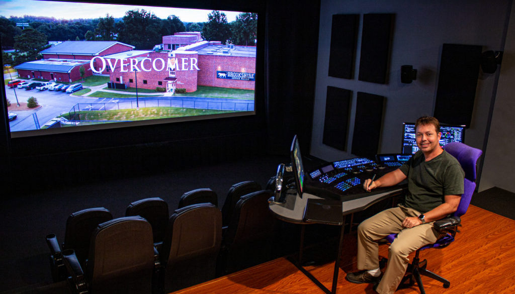
Roush Media provided dailies, digital intermediate color grading and digital cinema mastering services for Overcomer, the live-action family film from brothers Alex and Stephen Kendrick. The movie tells the story of a life-changing overnight for coach John Harrison, when his high school basketball team’s state championship dreams are crushed under the weight of unexpected news. When the largest manufacturing plant in town suddenly shuts down and hundreds of families begin moving away, the coach must come to grips with the challenges facing his family and his team.
“The producers wanted to create a stunningly beautiful film,” recalls Keith Roush, Roush Media founder. “They required expertise during pre-production and we created a workflow for supporting the vision of director Alex Kendrick throughout the production and post process.”
Supervising colorist Roush and DP Bob Scott sat down together at the facility before filming began.
“Keith Roush is a color genius,” says Scott. “I could not be happier with the final look of the film on the DI for Overcomer. Keith is a master technician and true artist who sees every detail. He even flew to Georgia to help create the look for our on-set color, which was invaluable during the shoot.”
Before
After
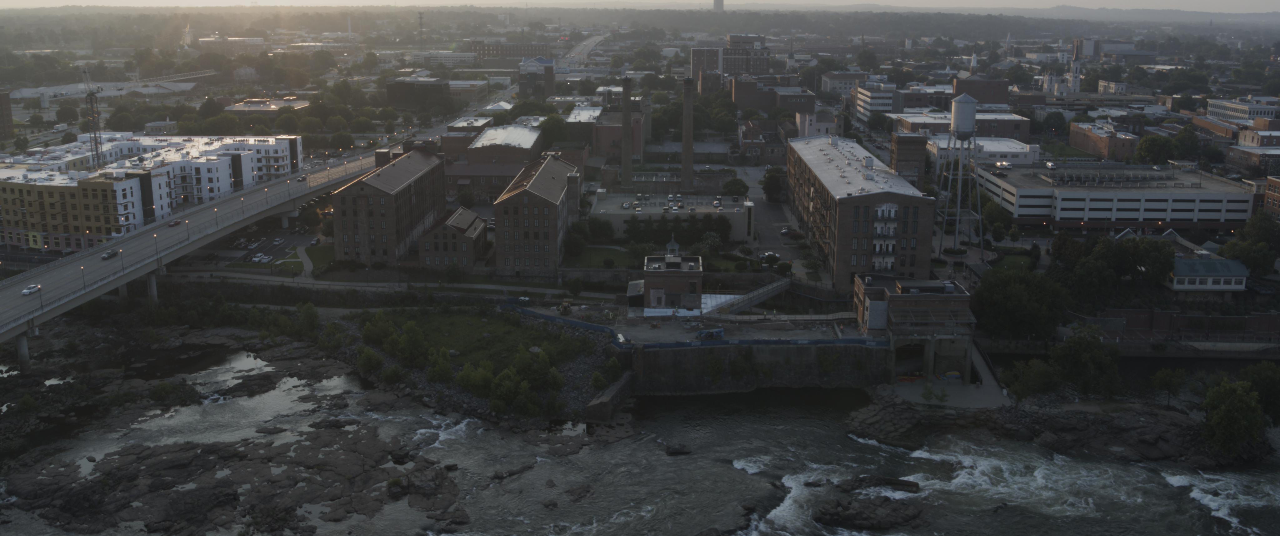
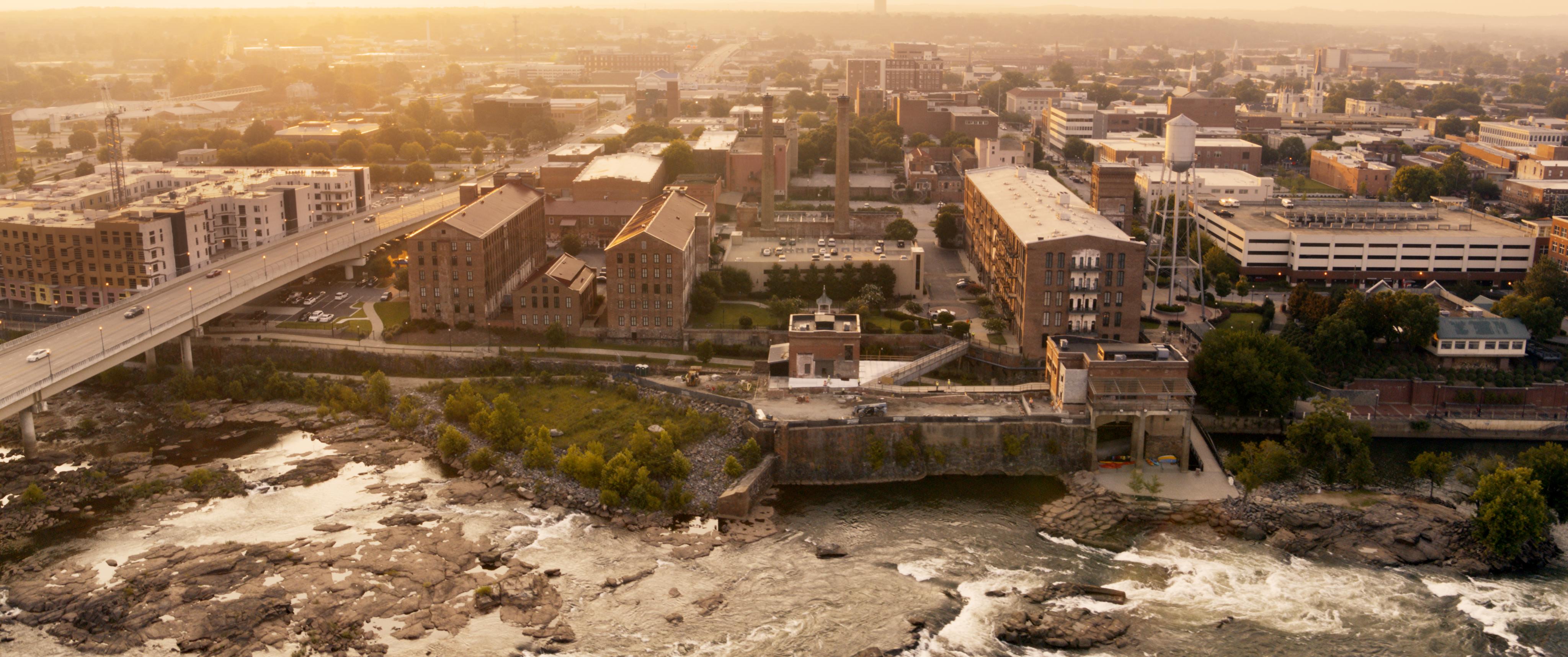
“After reviewing imagery of other films that Alex liked, we determined what he was looking for and how to achieve that,” Roush explains. A color suite was set up near-set in Columbus, GA, and Roush flew out from California to meet with Scott and Kendrick to finalize the look of the film just before production was to start shooting. A camera test with actors on-location was graded with Kendrick and Scott supervising.
In these look development sessions Roush, with Kendrick and Scott, carefully crafted the look that could work in HDR or SDR, with advanced color management that was monitored on-set right out of the camera. Editor Steve Hullfish, working near-set, sent over cuts of scenes that he thought for color reasons might require reshoots. Roush would then grade those scenes and send them back for review and approval, letting him know that reshoots were not required and any inconsistencies were easily fixable.
Before
After
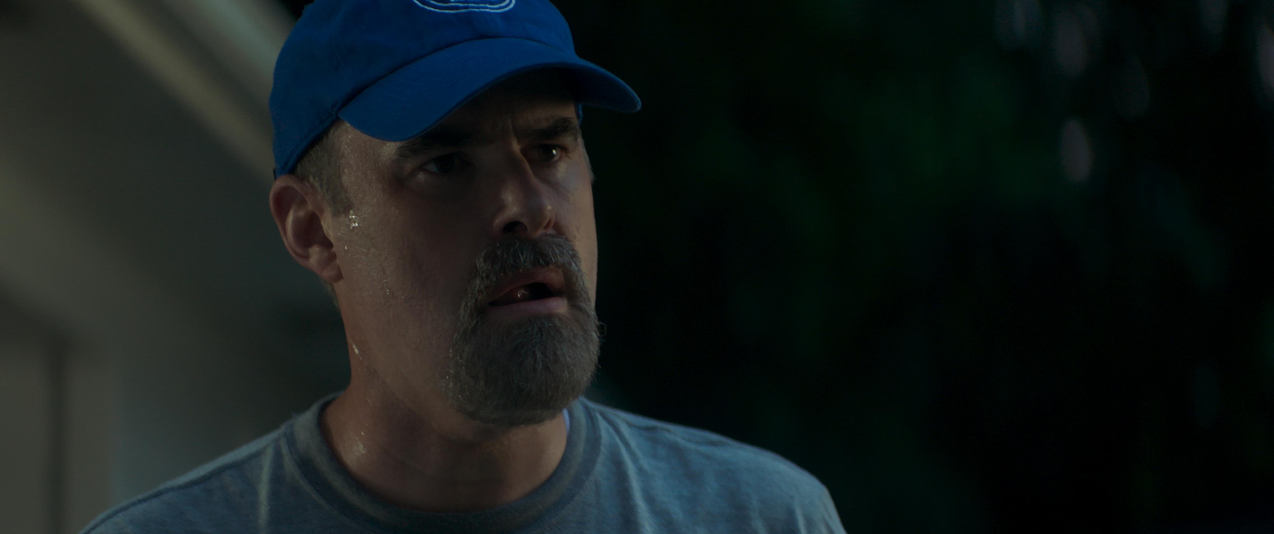
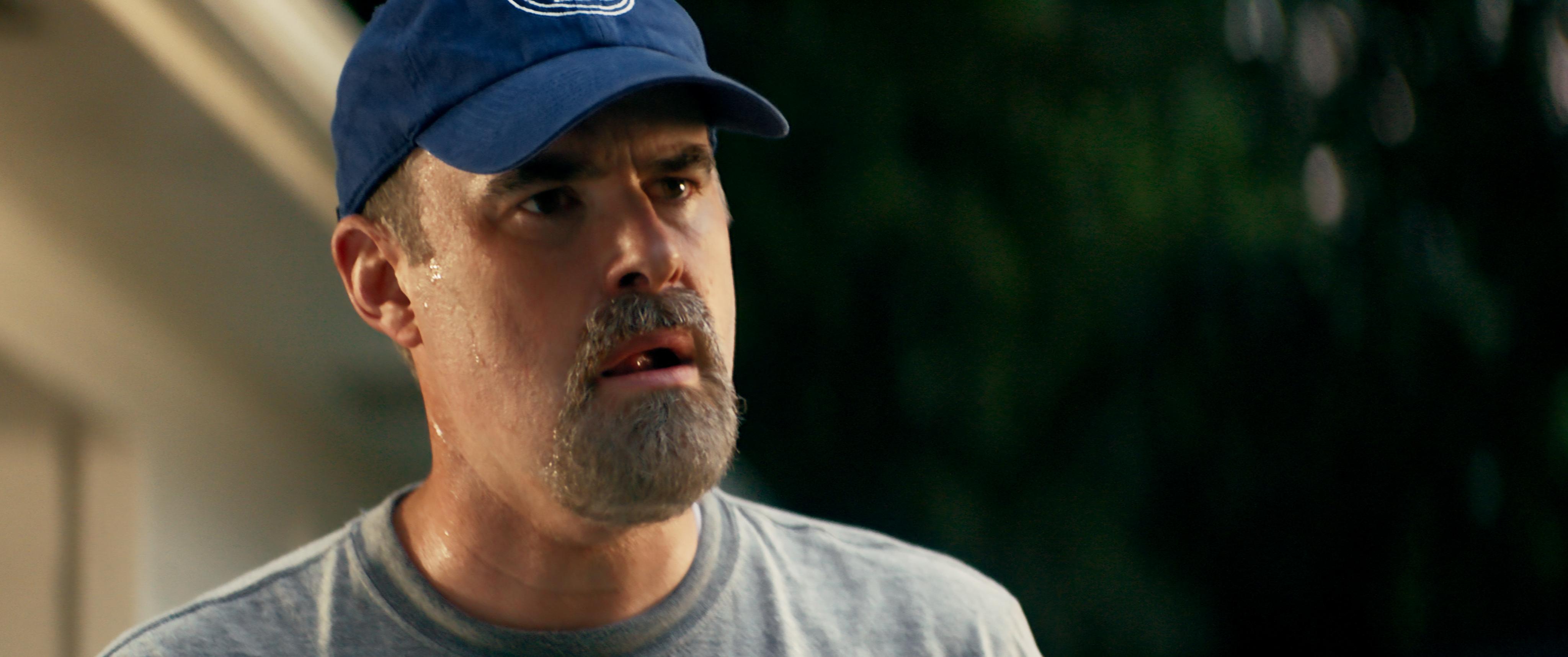
Roush managed the color pipelines for the VFX plates so that they would come back in and look as Kendrick and his DP intended.
“An important part of the DI process is managing the color pipeline through the VFX process,” says Roush. “Only the DI company truly has the expertise and knows the ramifications for any modifications to the color of the VFX plates.”
The conform artist pulled the effects plates and provided the necessary lookup tables to the VFX vendors.
“With consistent color results and the ability to simultaneously keep grading, even though final VFX shots are not delivered, they will pop in and match the underlined material. This process is highly efficient.
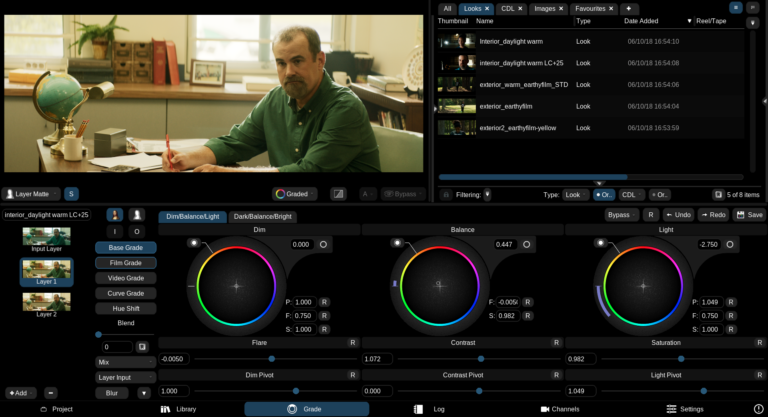
A live, remote color grading system was set up with a monitor, recommended and calibrated by Roush Media, placed in the director’s home. One to two-hour sessions were schedule with him to allow for feedback on the grades in progress before he came to the Roush Media theater for final review.
“Alex really enjoyed being able to see his colored images and collaborate with our team in real time on the other side of the country,” says Roush.
From these session notes the grade was continually refined so when the director came in for his final review in the theater, the process went smoothly with only a few tweaks.
The film was shot with Arri’s Alexa camera with anamorphic lenses, creating ProRes XQ at 2944×2160 (5760×2160 with the 2:1 desqueeze). Dailies were rendered for the Avid on-set, with the feature’s LUTs created by Roush’s on-set color system. Roush created Arri look files from the development sessions, which were then preloaded into the three Alexa cameras. This allowed the crew to see the look of the film live, on-set, while they were shooting. The project was color graded on a FilmLight Baselight system in 4K. A Barco projector was used for the P3D65 profile, and a Sony X300 display for the Dolby Vision version.
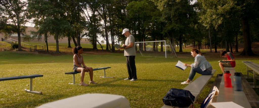
“I would describe the look we created for Overcomer as a bronzy wash, warm, earthy film look,” says Roush. “We changed the electronic bright greens of Georgia to a more subdued organic yellow green. We created an overall more film-like contrast with earthy, warmer tones throughout the film that need to be beautiful and lush without anything that was going to pop out and hit us, while still allowing for a lot of rich color and light to fill the screen.
“All of our color work is very subtle and detailed,” he continues. “There are areas where we pushed it more than others, and those tend to be the aerials. We did a lot of work to shape the way those feel and look – much like an ideal postcard from anytown USA. Additionally, we changed the color of the lakes to make them blue instead of mud colored, and we worked with skies a lot, (and) worked with faces and skin. For dark skin we liked warm milk chocolate. We’re like the invisible VFX. No one knows they’re there, but the image doesn’t come out of the camera looking like that.”
Roush notes that all of this was achieved while using an ACES color workflow because the team liked the look of the ACES RRT (Reference Rendering Transform) and the archival master could be an ACES master.

