The Art of Visual Effects: Enhancing the Horror of “Curse of the Necklace”
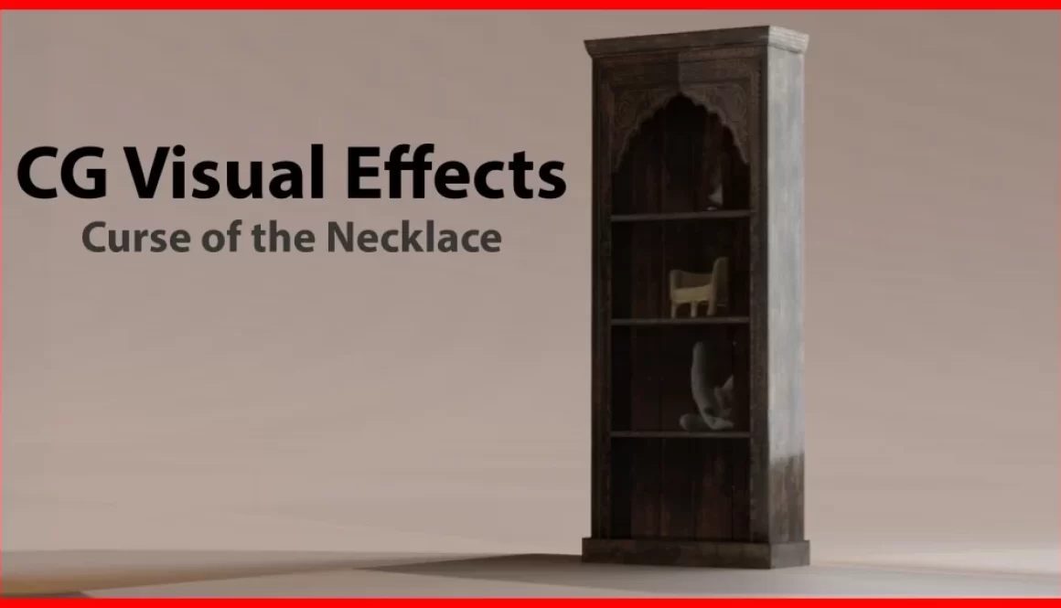
In a chilling scene from Juan Pablo Arias Muñoz’s late 2024 horror film “Curse of the Necklace,” a seemingly ordinary bookshelf takes on a sinister life of its own, becoming a menacing presence that perfectly encapsulates the film’s supernatural undertones. Achieving this level of tension and realism required a seamless blend of practical ingenuity and advanced visual effects techniques, spearheaded by the film’s on-set VFX supervisor, Connor Thomas.
Originally, the scene involving the bookshelf was to be captured entirely in-camera. The production team had planned a practical effect using a wire system to control the fall of a real bookshelf, ensuring it wouldn’t endanger the actress during the shoot. However, during a safety test, the wire failed, causing the bookshelf to collapse and rendering it unusable. While no one was hurt, this unexpected setback left the team scrambling for a solution that would maintain the director’s vision without compromising safety or the film’s tight schedule.
Connor Thomas quickly stepped in with a creative alternative: replace the bookshelf with a fully CG version that could be manipulated to achieve the desired look and feel. To ensure the CG bookshelf would integrate seamlessly into the live-action environment, Thomas took meticulous steps to gather the necessary visual and lighting references. Using a 50 MP camera, he captured high-quality HDRi images of the set to recreate the scene’s lighting and reflections accurately. These HDRi images provided the foundation for lighting the CG elements in Blender, the 3D pipeline of choice for the production.
Additionally, Thomas placed small tracking markers within the environment to facilitate 3D camera tracking in post-production. This ensured that the CG bookshelf would move naturally and align perfectly with the live-action footage, creating a convincing interaction between the digital and physical worlds.
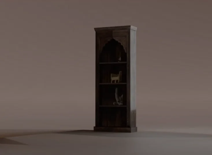
Blender’s versatility and robust toolset were instrumental in crafting the CG bookshelf. The team modeled a detailed replica, paying particular attention to the texture and weight of the wood to match the set’s aesthetic. Using the HDRi images, they were able to simulate the set’s lighting conditions, ensuring that the CG bookshelf reflected and refracted light in a way that was indistinguishable from its practical counterpart.
The team used Blender to animate the bookshelf’s unnatural fall, heightening the horror of the scene. The director, Juan Pablo Arias Muñoz, wanted the movement to feel otherworldly, as though an unseen force was guiding the bookshelf’s collapse. By exaggerating the timing and angles of the fall, the team was able to integrate the CG bookshelf with a supernatural presence that added to the film’s unsettling atmosphere.
Once the CG elements were rendered, the team turned to Nuke for compositing. Nuke’s node-based workflow allowed for precise integration of the CG bookshelf into the live-action footage. The tracking markers placed on set ensured that the CG elements matched the camera’s movements, while the HDRi lighting references helped blend the digital and practical elements seamlessly.
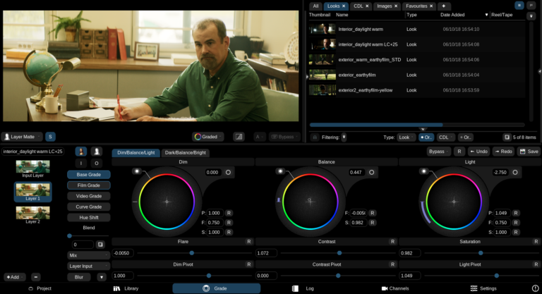
Through careful grading and the addition of subtle effects like dust and ambient shadows, the team enhanced the realism of the scene. The final shot not only replaced the broken practical bookshelf but also elevated the sequence by emphasizing the supernatural forces at play.
The decision to go fully CG with the bookshelf proved to be a blessing in disguise. The enhanced control over the object’s movement allowed the team to push the boundaries of what was physically possible, creating a more intense and visually striking moment. The bookshelf’s eerie, almost sentient behavior added a layer of terror that resonated with audiences, becoming one of the film’s most memorable sequences.
Watch more of the Behind the Scenes.

