168 Film Festival screens “I’m Not Ashamed” and all shorts on DCP mastered at ROUSH Media
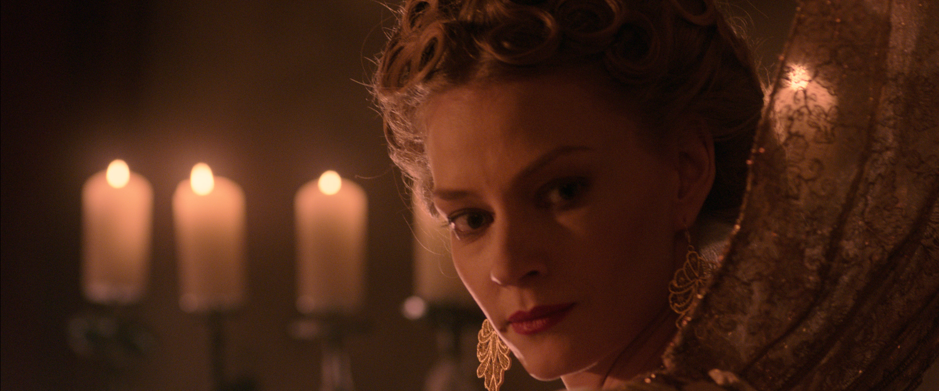
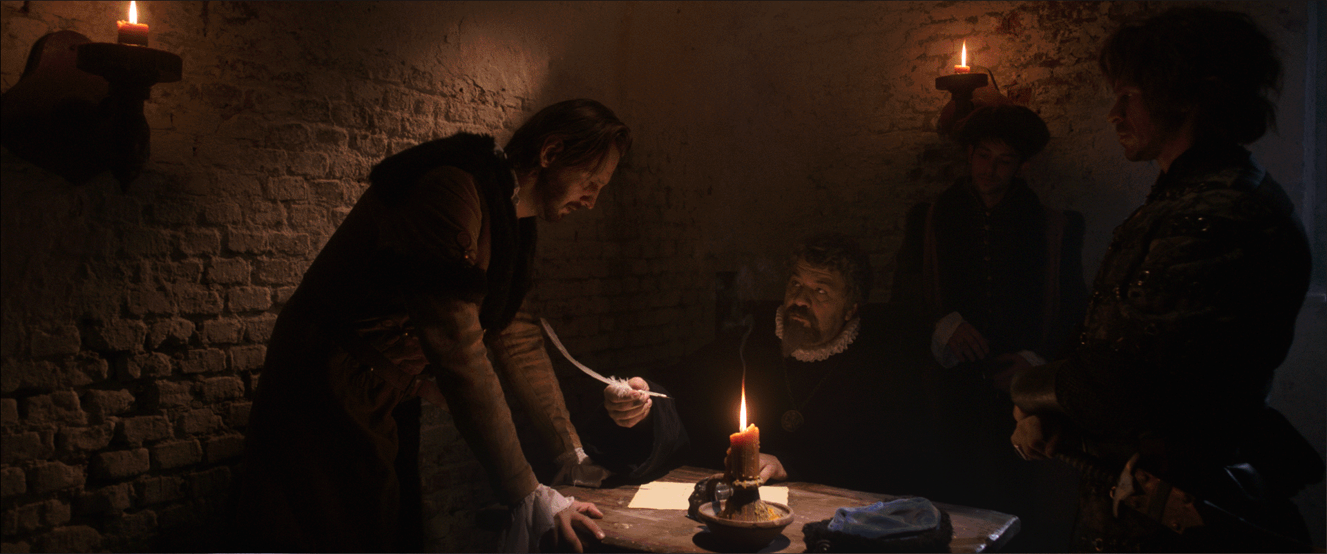
ROUSH Media is a color science and data management post-production services company which is sponsoring the 2016 168 Film Festival. This has made it possible for the 168 Film Festival to project all 50+ films from Digital Cinema Packages (DCP)! In addition, the Feature film “I’m Not Ashamed” (the inspiring true story of Rachel Joy Scott at Columbine High School) was finished at ROUSH Media by Senior Colorist Keith Roush and will have an advanced screening on 8-20-2016 at the 168 Festival.
“PureFlix has allowed the Festival to screen this inspiring film ahead of its October 21 release date for a wide audience. We are honored to support the Festival and feature as it aligns with our mission to work on films that make an impact on audiences,” says Keith Roush, CEO.
ROUSH MEDIA is an entertainment technology services company providing digital film services for feature films specializing in DI Color Grading, Mastering and Deliverables. As an award-winning DI post facility, it provides impressive color grading done right.
Roush Media has always been a respected DI color grading facility among its peers. Some of the top faith and family filmmakers trust ROUSH Media to craft stunning results the first time. (God’s Not Dead, War Room, Moms’ Night Out, Beyond the Mask, Old Fashioned, Faith Of Our Fathers, I’m Not Ashamed…) Proud sponsor of the 168 Film Project ROUSH Media will be continuing the tradition of awarding three $1,000 gift certificates to the Best Editor, Cinematographer and Film. The certificates will cover Post-Production services including Dailies, Conform, DI Color Grading, Digital Cinema Mastering, and Screening Room Rentals, and more.
The 168 Film Project is a faith friendly, values-friendly practicum for artists focused on the media. 168 provides a proving ground for filmmakers, writers, actors and all interested in creating stories for popular culture.
More than an international short film competition, “168” asks deep questions. Whether subtle, or bold in message, “168” stories change lives and help to redefine the genre in terms of quality and inspirational message.
Please understand that taking story from scripture does not mean you must make the next Jesus movie. It’s all about having a certain message and delivering it to your audience. To do well in 168, artists must make compelling entertainment. Pop culture needn’t be at odds with faith-based, faith-friendly or values entertainment. We value all three.
At ROUSH Media we are proud to support the vision of Christian Filmmakers.
For more info visit http://www.168film.com/